These Interesting Maps Will Make You Want to Study STEM
Lizzy Campbell
13 Feb 2025
What do your students think maps are used for?
Maybe, they see maps as a tool to get them from A to B. Maybe, they see a map as the poster that hangs in the classroom.
Chances are, they don’t fully understand just how amazingly useful and interesting maps can be.
Topics around geography, geospatial science and mapping can be traditionally viewed as a bit boring. We’re here to change that with this list of amazing, revolutionary, interesting, and highly useful maps.
Show this to your students to inspire them to see maps, geography, and geospatial science for the incredible fields that they are (and maybe inspire yourself at the same time!)
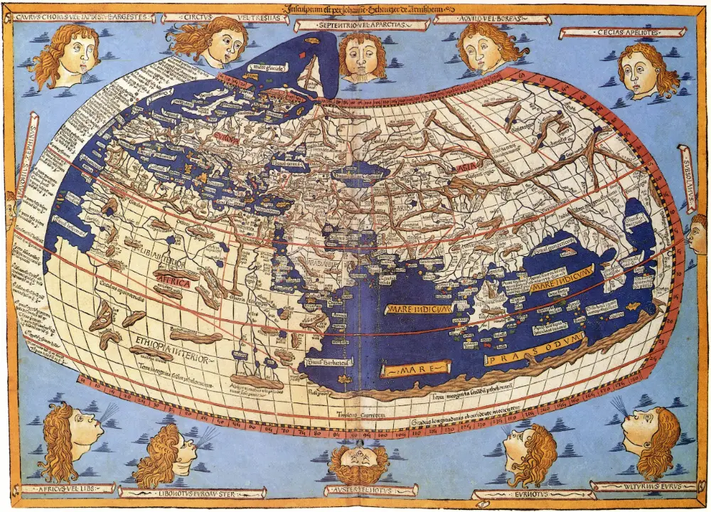
1. This world map revolutionised geography
Reconstruction of Ptolemy's world map based on his projections (Wikimedia Commons)
While its not the very first known world map (the Babylonian map of the world, carved into stone around 600 B.C.), it is arguably more influential due to its use of mathematical projections.
Ptolemy (c. 100-178) created a grid of intersecting lines and invented two map projections that would go on to be used by geographers and mapmakers centuries later.
No maps that Ptolemy drew have ever been found. His textbook, Geography, was discovered and the first drawings of his map began in 1295 by Byzantine monks. The image above is a 15th Century reconstruction.
What is truly amazing about Ptolemy is that he may never have drawn a map in his life but he is still so influential. He shows just how important mathematics is to mapping. We now use his intersecting grid, modern-day latitudinal and longitudinal calculations, to accurately pinpoint where something is in the world.
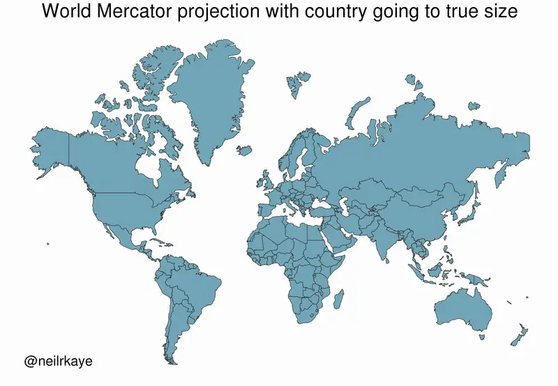
2. This controversial Mercator map is still used today
The Mercator projection is a map that is familiar to many of us. You may even find it in your school classrooms. It has become very controversial recently for its depiction of a ‘Eurocentric’ world.
You can see in the image that European nations are actually a lot smaller than the Mercator projection depicts them.
Critics say this is because the cartographer, Gerardus Mercator, was from modern-day Belgium.
However, this projection-style map was intended for nautical navigation use. In 1569, when Mercator created the map, navigators on ships were using paper maps, which are, of course, two-dimensional.
The Mercator projection is a 3D cylindrical projection of the world onto a 2D surface, which is why many countries, not just European ones — Greenland, Russia, and Canada especially — are so inflated.
So, the issue with the Mercator map isn’t necessarily that it is trying to promote a pro-Europe, pro-Russia view of the world. It’s that we’re using a very old map intended for nautical purposes to understand the world.
When we look at maps, we need to:
Understand what their purpose is, and what they are trying to depict, to know whether they are appropriate to use.
Critically think about the distortions that occur when we try and depict 3D things (the world) onto 2D planes.
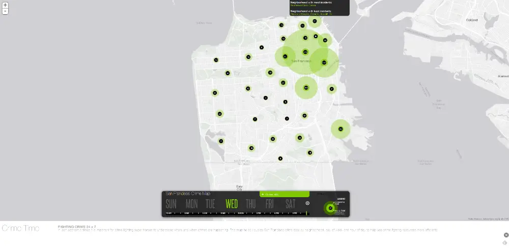
3. This map helps create preventative solutions to crime
Source: Cool Maps - ESRI
It sounds simple but maps tell us where things are happening. This map shows where crime hotspots are around San Francisco. There are three main pieces of information (data) that are mapped here:
1. A criminal incident 2. The location of the criminal incident 3. The time of the criminal incident
By overlaying these three pieces of data onto a map of San Francisco, it suddenly becomes very easy to see where crime is happening, on what day and at what time.
This is an incredibly useful piece of data for cities to use to employ preventative measures or to help find potential reasons why the crime is happening in an area or at a certain time. This is a great way of analysing data for social good — to find solutions that prevent crime happening, rather than just trying to punish it after it happens.
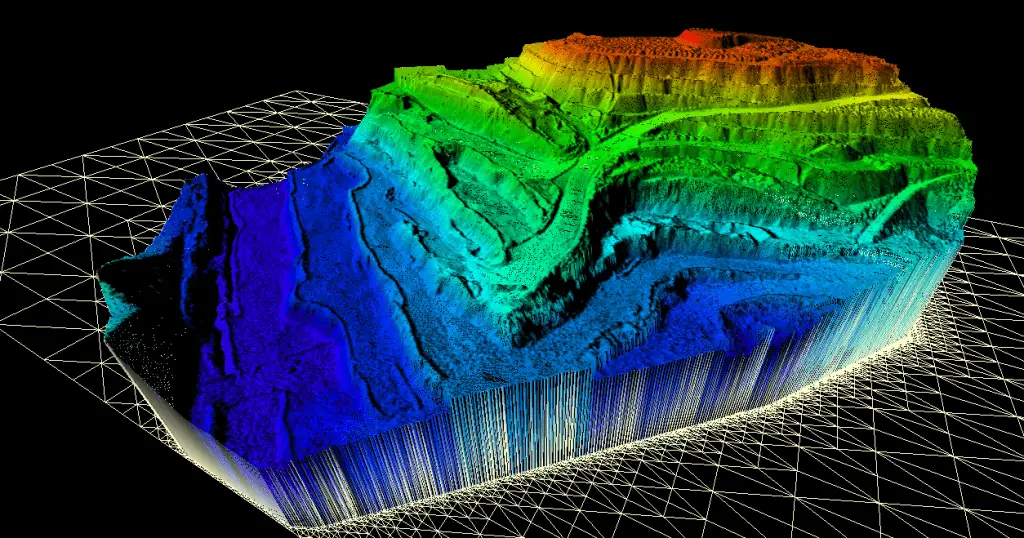
4. This map lets us see places and objects in 3D
Source: West Coast Placer
This technology keeps getting better and better.
Photogrammetry helps to create images that can be seen in 3D by overlaying images from multiple angles. Photogrammic models are incredibly useful for all kinds of decision-making in fields such as architecture, quality control, engineering, and even cultural heritage.
First responders can gain a good understanding of a building in 3D before they go inside, for instance, the height of a wall, or potential access routes.
The image above is a coal mine. The coloured topography makes it clear to see the different depths, which is incredibly useful for many different people working on this job site.
There are a lot of different photogrammetry models showing everything from contours to relief displacement. This article goes into these in more depth.
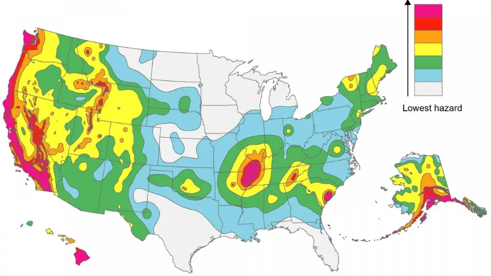
5. This map helps us identify hazards
Source: Science Magazine
Much like the map showing where crime is present in San Francisco, hazard maps tell us, or predict, where hazards are.
This is an overview of where scientists believe potential earthquakes could occur in the United States. By showing this as a colourful overview, it is very easy for anyone to quickly and easily understand what areas of the United States could be at risk.
They help prevent damage, injuries, and death by easily conveying the risk that different regions need to prepare for. In the case of earthquakes, this is useful for building and urban planning, to know which areas need strict building codes around earthquake safety.
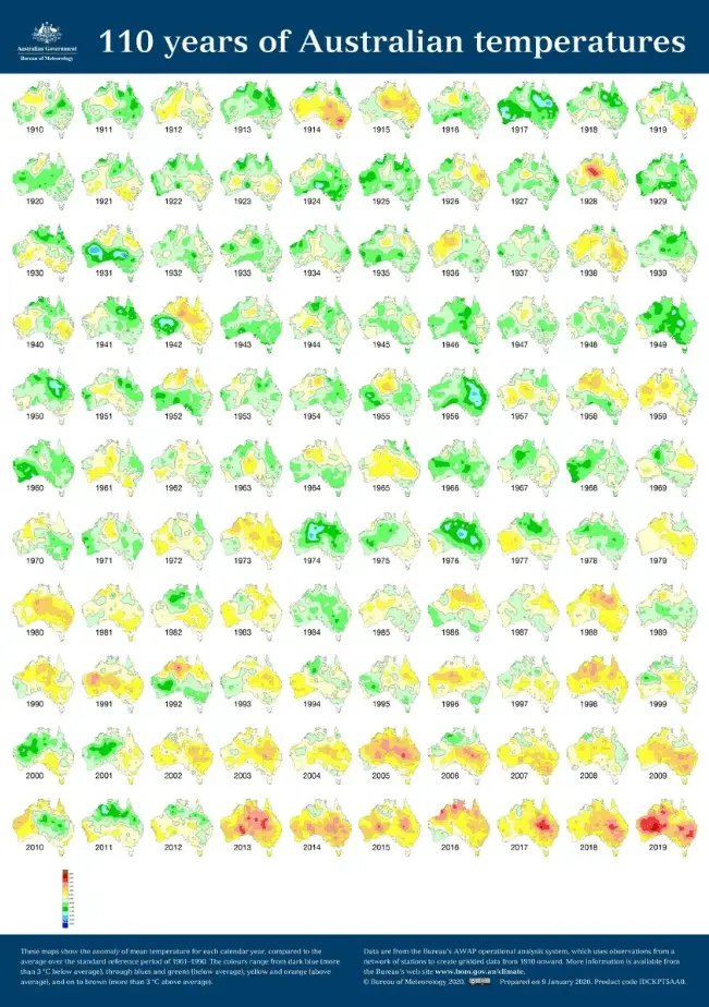
6. This map helps to understand climate change
Mean temperature anomalies in Australia, 1910-2019. Source: Australian Government, Bureau of Meteorology
Or, should we say maps. Lots of maps. Comparing the same map over time helps us see how things change.
The biggest change facing our planet right now is climate change. Climate change is the change over time of different conditions on Earth, such as temperature and rainfall.
It’s important to look past individual weather events and measure this across long periods of time so that we can see trends, rather than one-off occurences — a hot year or a hot day.
When we look at these maps of Australia from the past century, it is impossible to deny that the temperature in Australia is getting hotter.
It’s also historically interesting to look at. We can see from these maps that the temperature was higher than usual in 1914 and 1915. This suggests that there was some kind of drought. When we compare this to information at the time, this confirms that there was a drought in Australia.
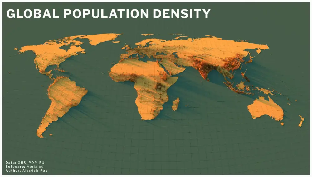
7. This map helps us understand our place in the world
Source: Twitter - @undertheradar
It can be easy to think we’re at the centre of everything — that’s what our brains are designed to do. This map is a fascinating reminder that there are so many people in so many different parts of the world.
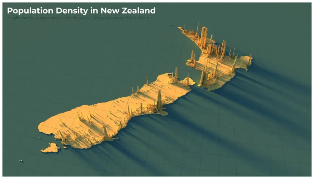
Understanding how many people are in certain areas is very useful during a pandemic. COVID-19 is easily transmitted when people come into close contact with each other. When we zoom to this map of New Zealand (below), it’s easy to see where strict lockdowns need to take place in order to not transmit the virus.
Source: Twitter - @undertheradar
Maps come in all different forms. Some are huge, like a map of the entire world or an entire country. Whereas others only show one thing, like a coal mine or an aerial view of where objects are.
Maps serve incredibly important purposes. They help us make better decisions, especially in situations of risk or hazard. Maps help us understand things such as where political borders are, knowing where natural resources are and how they change over time, or what the shape of the land is that we are working on.
And maps help us understand our sense of place beyond just what our eyes can see (which is pretty limiting when you look at what these maps show!)
That’s why maps are so interesting and mesmerising to look at.
If you want to start learning how to use maps for a useful purpose, we recommend starting with our online Classroom Mapping Essentials Teacher Professional Development. Through carefully curated resources, hands-on activities, and flexible learning modules, you’ll gain the expertise needed to help students develop essential geospatial skills—preparing them to analyse, interpret, make informed decisions, and create maps using spatial data.
She Maps is Australia’s leading expert in drone and geospatial education.
She Maps assist schools with the purchasing of drones, school-industry created drone and geospatial teaching resources and highly supportive teacher professional development.
FREE eBook – How to start a drone program at your school – Teachers Guide – Download Now
Learning Solutions Guide – Programs, Products and Pricing Guide – Read now
Ready to buy drones for your school? Browse our convenient classroom kits!
You’re in Safe Hands!
She Maps is a CASA approved commercial operator to fly microdrones indoors with students and teachers. CASA holds commercial operators, to a higher standard than recreational users and educators. This means that She Maps has been assessed by CASA as having rigorous training and risk mitigation procedures in place.
Want some help?
Schedule a call with one of our team members to get some personalised recommendations.
Take our resources for a spin and join the thousands of teachers who love our ready-to-teach classroom materials. Try one of our complete units of work for free.